Fixing Legacy UX: A Heuristic Lens on Redesigning Njuškalo Catalogs


What if your next big UX challenge was also your biggest opportunity?
Redesigning a long-standing app isn’t just about fixing what’s broken — it’s about rethinking how it could be even better.
At Njuškalo, we saw exactly that opportunity in front of us with Njuškalo Catalogs, a mobile app that helps users browse store catalogs and discover current offers nearby. The app had served its purpose for years, but it hadn’t kept up with the evolving expectations of mobile users. It was time for a fresh start — one that would modernize the experience, simplify the interface, and reintroduce value to everyday users.
But when you have such a task, where do you even begin — the UI, the logic, the experience? It’s easy to feel overwhelmed.
Instead of diving straight into pixels and prototypes, I took a step back. Using Jakob Nielsen’s 10 usability heuristics, I ran a structured UX evaluation to spot the biggest issues — not by guessing, but by applying time-tested principles. This approach helped me untangle the chaos, identify patterns of friction, and lay the groundwork for a redesign that felt intentional, not improvised.
In this post, I’ll walk you through how applying just three core UX heuristics helped shape a cleaner, more intuitive version of Njuškalo Catalogs — and how even a few core principles can drive meaningful design improvements.
“The design should always keep users informed about what is going on, through appropriate feedback within a reasonable amount of time.”
— Jakob Nielsen
The app allowed users to subscribe to four different types of notifications: new offers from store, catalog releases, category-based offers, and saved searches. However, the interface presented all of these options using the exact same call-to-action button labeled “Enable/Disable” with a nearby label saying “Get notified about offers.”
This repeated, non-specific phrasing failed to provide users with clear feedback about the nature of the action or its consequences. Despite being visually identical, each instance triggered a different type of notification. Because of this, the interface did not communicate the system’s state or the result of the user’s action, violating the heuristic that users should always be informed about what is happening and what to expect.
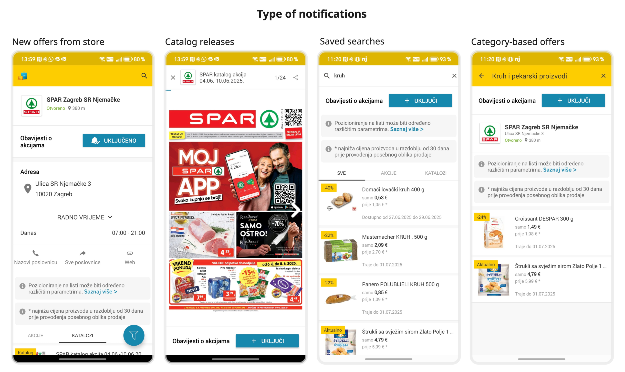
Screens from the old version of the app showing different notification types
Without clear contextual feedback, users had difficulty distinguishing between notification types— an opportunity we recognized to create a more transparent and predictable interaction model. Addressing this helped bring clarity to user actions, reduce uncertainty, and improve the predictability of the system’s behavior.
The subscription component was redesigned to provide clear, contextual feedback about what specific notifications user can activate. The updated version includes a bell icon representing notification status (active/inactive), descriptive labels, and separate toggles for different notification types. For example:
The same component is used consistently on both catalog and store screens, aligning visual feedback with system logic.
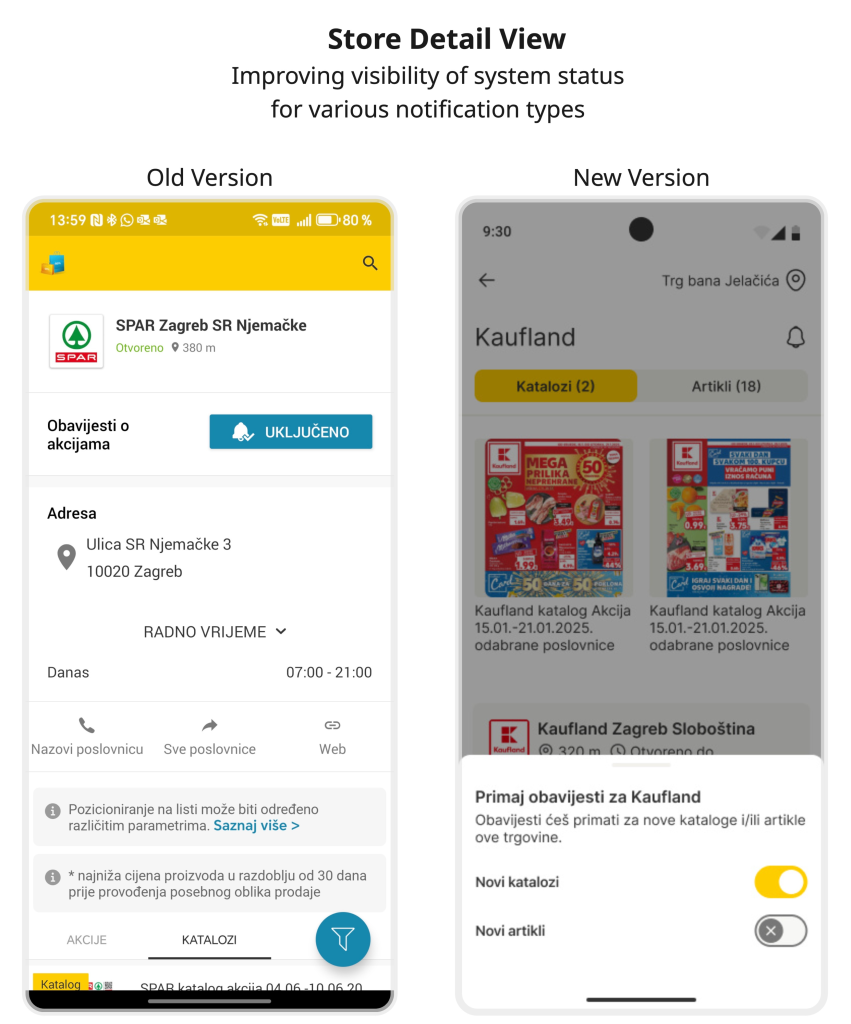
Image shows a comparison of the notification subscription component on the store detail view
As the Visibility System Status heuristic states, the system should always inform users about what is happening, using appropriate and timely feedback. The old interface lacked this clarity, making it hard to understand the consequences of interaction. The new design addresses this by providing better UX copy and relevant feedback, making the interface more transparent and reducing cognitive effort. This change not only improved clarity, but also brought the notification experience closer to what users expect — reflecting Njuškalo’s commitment to practical, user-first improvements.
Jakob’s Law states that users spend most of their time on other digital products, which shape their expectations. When your app breaks consistency or common standards, it increases users’ cognitive load because they must learn new, unexpected behaviors. Users should not have to guess if different words, icons, or actions mean the same thing. It is important to follow platform and industry conventions to keep the experience intuitive.
These inconsistencies disrupt the user experience by making it less predictable and harder to learn. Users may hesitate, make mistakes, or feel frustrated because the app doesn’t behave like other apps they are used to.
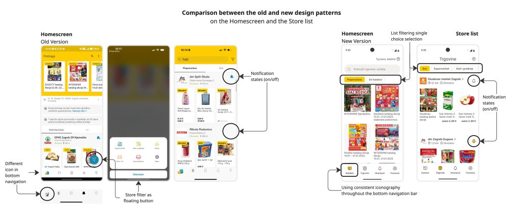
Comparison between the old and new design patterns on the Homescreen and the Store list
The redesign focused on standardizing icons, buttons, navigation, and interactions to align with common platform conventions and user expectations. For example:

Comparison between the old and new design patterns on the Store and Offer Detail View
By improving consistency and following best practices, the app reduces cognitive load, making it easier and faster for users to understand and use the app. This creates a smoother, more intuitive experience that aligns with familiar digital product behaviors — and reflects Njuškalo’s commitment to building clear, trustworthy, and user-focused experiences that deliver everyday value.
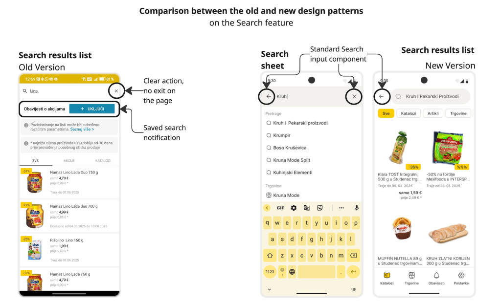
Comparison between the old and new design patterns on the Search feature
“Interfaces should not contain information which is irrelevant or rarely needed. Every extra unit of information in an interface competes with the relevant units of information and diminishes their relative visibility.”
— Jakob Nielsen
As the app evolved and gained more features over time, its visual layout became increasingly dense, which made navigation more demanding for users. This result of growth signaled that it was the right moment to refine and simplify.
Many screens were displaying too much information at once, often without clear prioritization or structure. This presented an opportunity to revisit the visual hierarchy and bring the interface in line with the principles of Aesthetic and Minimalist Design — showing only what’s necessary at the right time.
One of the biggest UX challenges was the design of the Store Detail View and Offer Detail View. These screens presented scattered content without clear grouping or focus. Actionable elements were visually indistinguishable from passive elements, and the layout didn’t guide the user’s attention toward the most important elements or information.
Visually, the design ignored core Gestalt principles — such as proximity, common region, and chunking — which help users quickly interpret and navigate content. As a result, key information was fragmented across the interface, increasing cognitive load and making it harder for users to make sense of the content structure. That contradicts the very goal of simple design: to reduce mental effort by showing only what’s necessary.
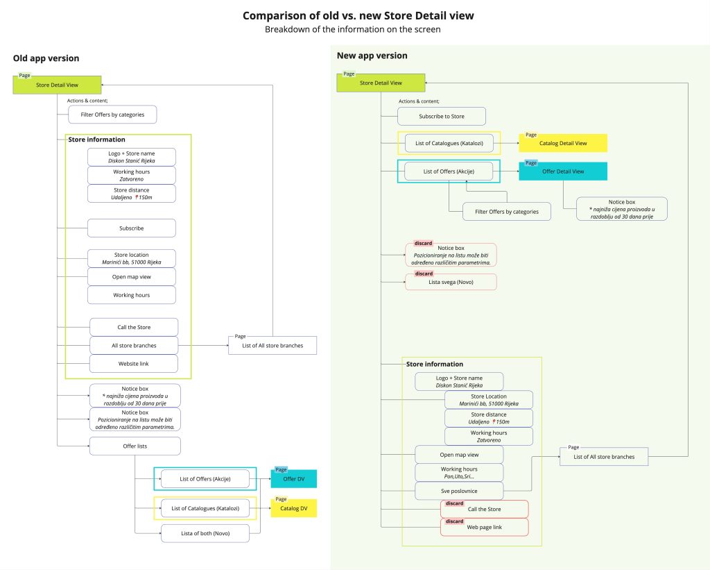
Breakdown of the information on the Store Detail View
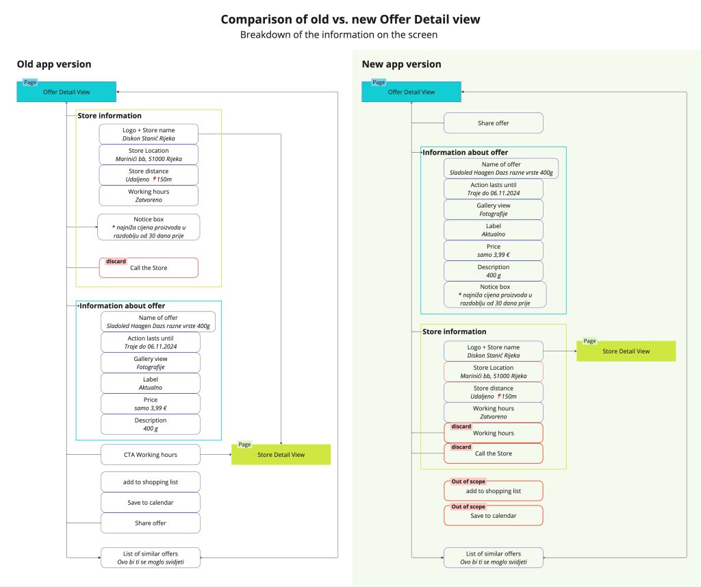
Breakdown of the information on the Offer Detail View
Redesigning the Store and Offer detail view pages required close collaboration with stakeholders. Using side-by-side comparisons, we reviewed which features were still relevant and which ones could be removed. This process helped streamline the experience and ensured only valuable information made it into the new version.
The updated design introduces clear visual hierarchy, grouping related content together and placing actions where users expect to find them. We focused on simplifying each screen to show just the right amount of detail — enough to be useful, but not overwhelming. Consistent UI patterns were used across screens to support recognition and reduce unnecessary mental effort.
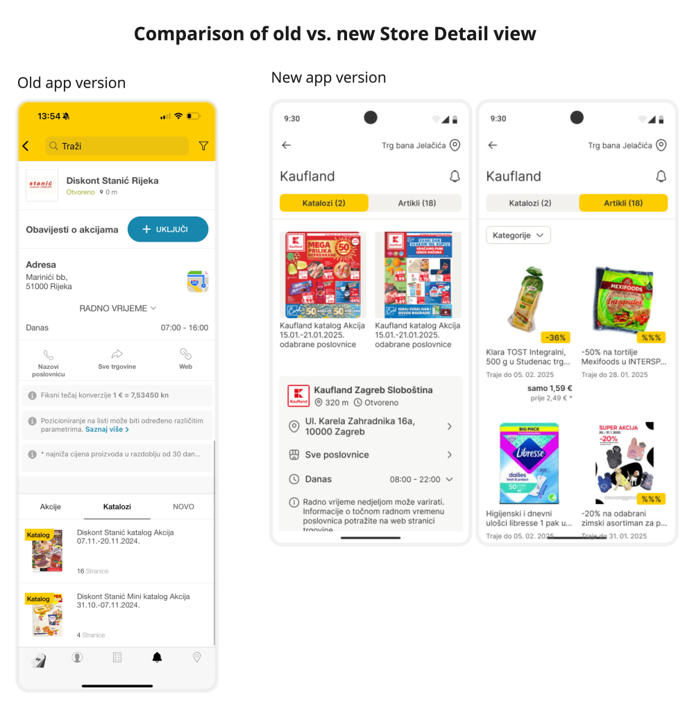
Comparison of old vs. new Store Detail View
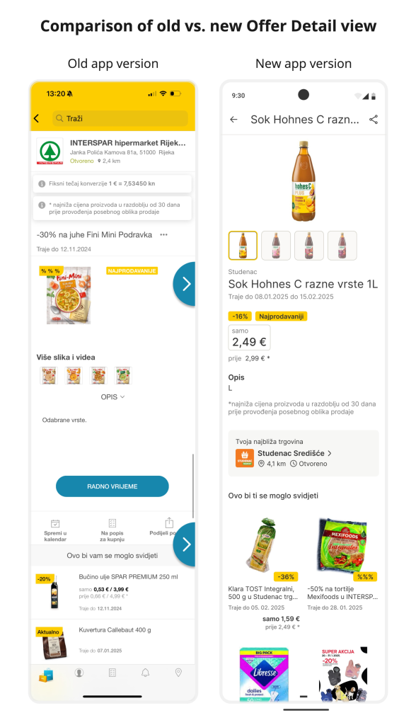
Comparison of old vs. new Offer Detail View
Making design simple isn’t just about having fewer elements — it’s about showing the right ones. When visual hierarchy is lacking, users struggle to understand what matters and what to do next. By decluttering the UI, removing outdated or irrelevant features and applying Gestalt principles, the new design makes it easier for users to find what they need – not just more attractive. It reinforces a product philosophy that puts clarity, usefulness, and everyday relevance at the center of the user experience.
Redesigning an outdated app can feel overwhelming — like trying to fix everything at once. Heuristics gave me a way to zoom in on what truly mattered. By relying on timeless UX principles grounded in human behavior, I was able to spot weak points, simplify decisions, and stay focused without needing to guess or test every detail.
This wasn’t a formal report or something I used to convince others. Everyone already recognized the app’s potential could be unlocked with better UX. This was away for me to make order out of chaos — to break a big redesign into smaller, solvable problems.
In the end, for me, applying heuristics was less about checking boxes and more about building confidence. We weren’t just fixing the past — we were building a stronger foundation for what’s next. Heuristics gave me confidence that the improvements actually mattered — and that I wasn’t losing sight of the UX fundamentals along the way.